

Portfolio Pieces
Welcome! On this page you’ll find project pieces I have complete throughout my college years. My time in college has allowed me the opportunity to explore different realms of graphic design from website building to product packaging work! Alongside graphic design I also love photography and trying new medias.
Postage Stamp
The postage stamp is a miniature artwork with the ability to travel globally, carrying identity/personality and storytelling in its compact form. Its small yet powerful design can scale upward into campaign materials, billboards, or digital ads while still keeping its integrity.
Inspiration:
This project began as a tribute to the legendary designer Chip Kidd, with a focus on his unmistakable glasses. The goal was to distill his iconic eyewear into a visual shorthand recognizable to anyone familiar with design culture.


The Image/Word project explores the power of visual language, pairing text and imagery to change perception and meaning. When modified across billboards, motion graphics, or social media posts, it invites viewers to actively interpret and engage. Through design we can show how images and words can create a flexible identity system that sparks conversation both in intimate spaces and public arenas.
Inspiration:
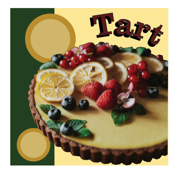
Rooted in a childhood obsession with baking, wordplay, and design. This series integrates whimsical visuals and clever text. The inspiration came from seeing how the same word could encapsulate different aesthetics from 90’s to modern luxury. Process wise I peeked into older packaging and seeing what truly grabbed my eyes about it.


Image & Word
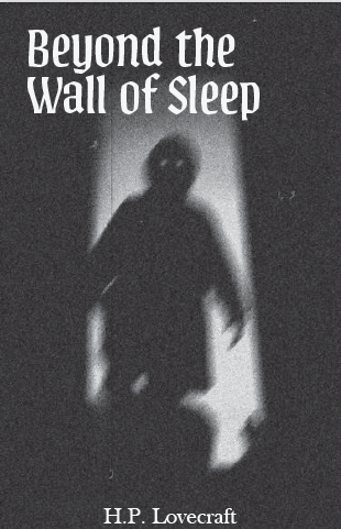
Short Story Cover
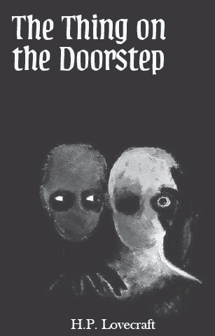
An intimate narrative that can extended beyond print it and capture imagination through both words and visual design. By extending into social media teasers, animated excerpts, or serialized email releases, the short story publication is able to become a multi-platform reading experience for people who lean to either the visual or literature route. This approach positions stories as more than just a simple book it develops into an ecosystem that keeps audiences engaged before and after they read it.
Inspiration:
The inspiration came from nights spent re-reading gothic tales and imagining how illustration could evoke the unsettling moods that words alone create. Absolutely love horror movies and stories, so H.P Lovecraft was the perfect choice to evoke the eerie feeling that his stories bring on. Took inspiration from stores growing up such as “Scary stories to read in the dark” series.

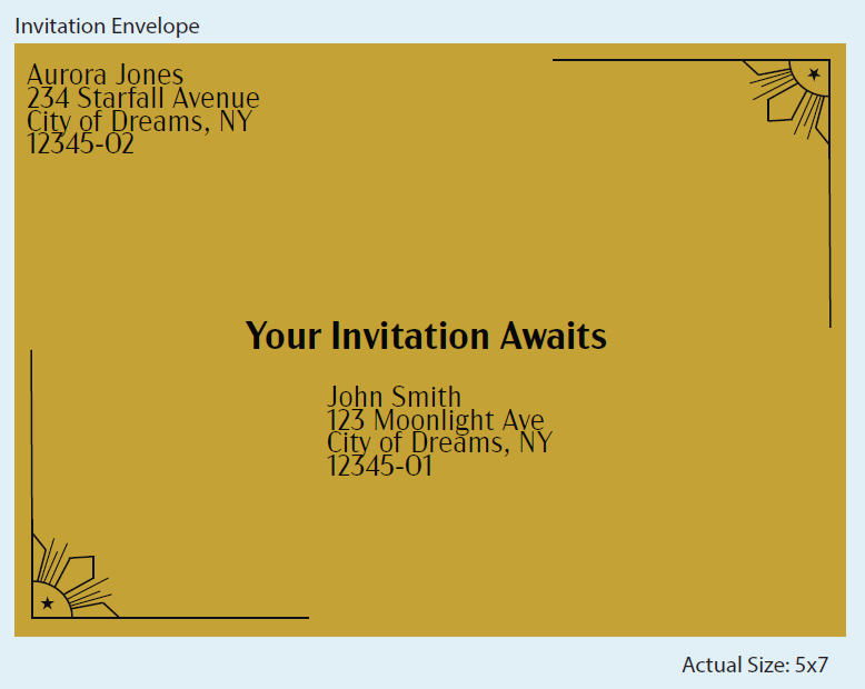


Event Invitation
An event invitation is not just an announcement, it’s a persons first immersive step into the experience itself and what they can expect at the even overall. Its design extends naturally to digital RSVPs, animated countdowns, personalized email reminders, and venue/wayfinding signage, ensuring brand consistency from introduction to arrival. When done correctly can create a lasting impact on someones mind for years to come.
Inspiration:
Inspired by a deep longing for the romance and grandeur of masquerade balls, this invitation set is a love letter to the elegance and intrigue of the 1920s. The creative process involved researching Art Deco motifs, lavish materials, and the jazz age spirit, aiming to transport recipients to a bygone era of glittering chandeliers and secret identities.
Cylindrical Packaging
The cylindrical packaging design is able to highlight form as much as function, and can create a striking product presence that stands out in an overlycrowded marketplace. This shape translates beautifully into 3D animations for digital ads, and shelf ready displays. The project encapsulates how packaging design can extend into storytelling, compelling visuals and also creating brand recognition that resonates both in physical retail spaces and digital marketing campaigns.
Inspiration:
Was inspired by camping trips with friends and family, as well as, video games like the Fallout series. Having that vintage yet apocalyptic feeling was key to the overall feeling. Wanting a product and package that felt essential and memorable, the process leaned into experiments with form, and playful protection, hoping customers would feel a sense of preparation and playfulness when unboxing


Subscription Box
The subscription box project is about designing not only a package, but an experience that customers anticipate each month. Its branding can extend into email marketing previews, social media unboxing trends, and influencer partnerships, amplifying reach far beyond the physical box. For all drink lovers this box can open even picky drinkers or avid explorers to a world of new cocktails from around the world.
Inspiration:
The box grew from my parents having a liquor cabinet at home and seeing the cocktails they would make where the creativity behind each cocktail made became a special drink. Designing the unboxing experience was a way to share the personal excitement about trying new flavors in adulthood and reimagining drinks as monthly “artwork to sip,”
Festival Website
It is more than a website, it’s a digital festival hub that adapts across media (laptop and phone), creating excitement for before, during, and even after the event. It can expand into interactive social media campaigns, countdown ads, and wayfinding signage at the festival itself. When done correctly it is transforming online engagement into real-world energy and anticipation.
Inspiration:
From a love of rock stemming from my father, this rock festival website was a means of giving rock music an electric home. Name wise it came from the deafening loudness that rock festivals create. The website came as a means to get the audience excited about the artists and the experience that lies ahead.


